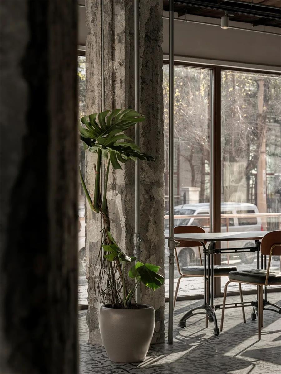
SAUCE UP is a delicate western-style diner in Shenyang. Its name is a reference from Pink Floyd’s album A Saucerful of Secrets. The space sparks diversity. It is fragmented yet all-inclusive, hoping to convey a sense of casual and coziness.
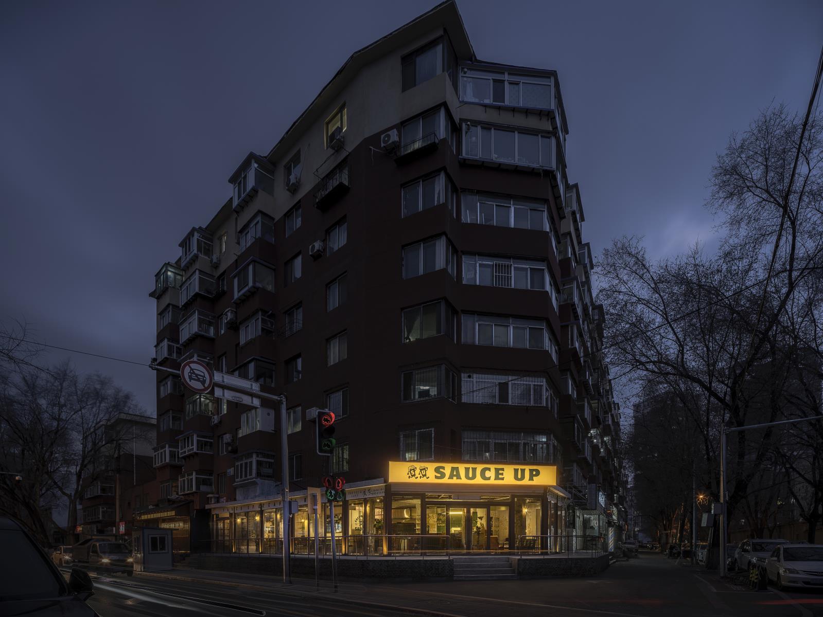
The diner is located on the first floor of a street in the old district of Shenyang. The storefront faces two sides. Since the site used to be a grocery store, the original layout is mostly one open space, enclosed by floor-to-ceiling windows.
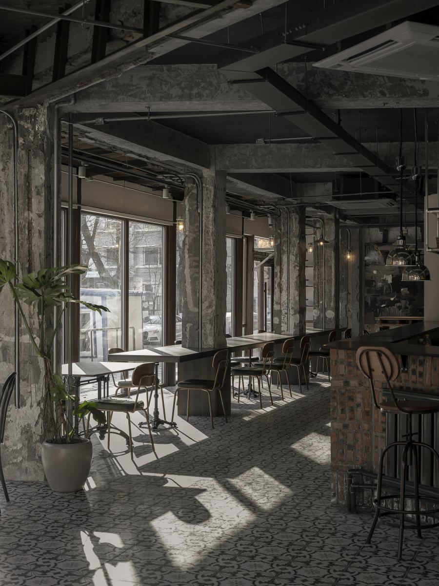
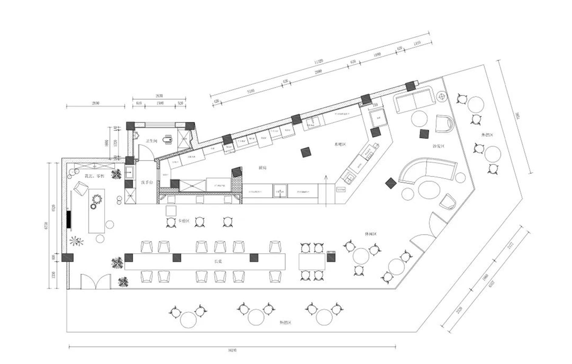
The original floor-plan had an irregular shape. The pillars were asymmetrical and illogically placed. We took into account the locations of the pillars as well as the dining experience to partition the space into different functional areas, creating a harmonious ambience.
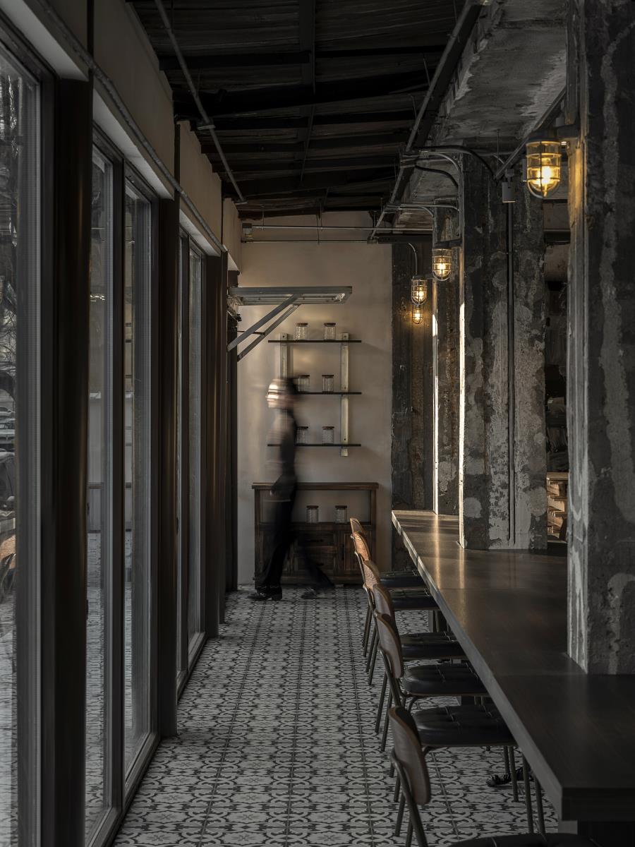
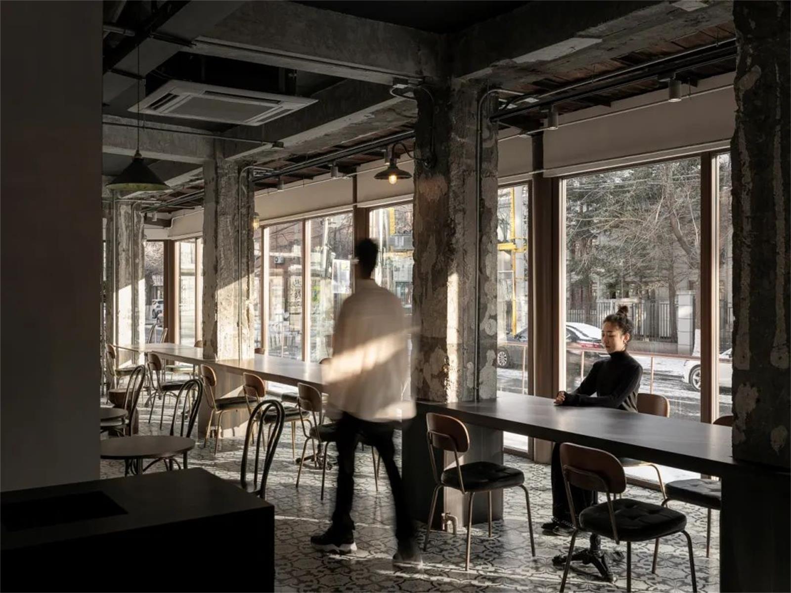
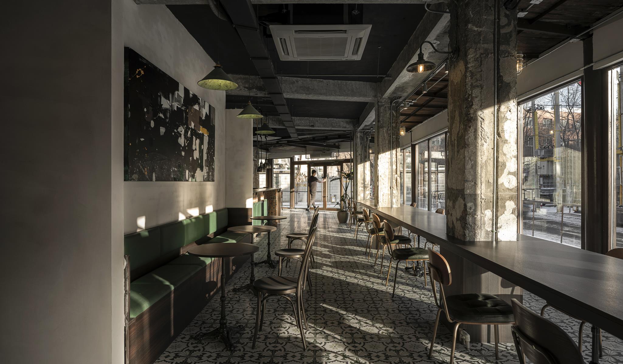
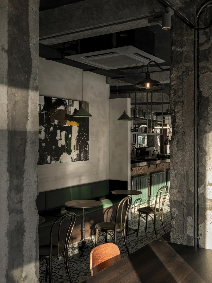
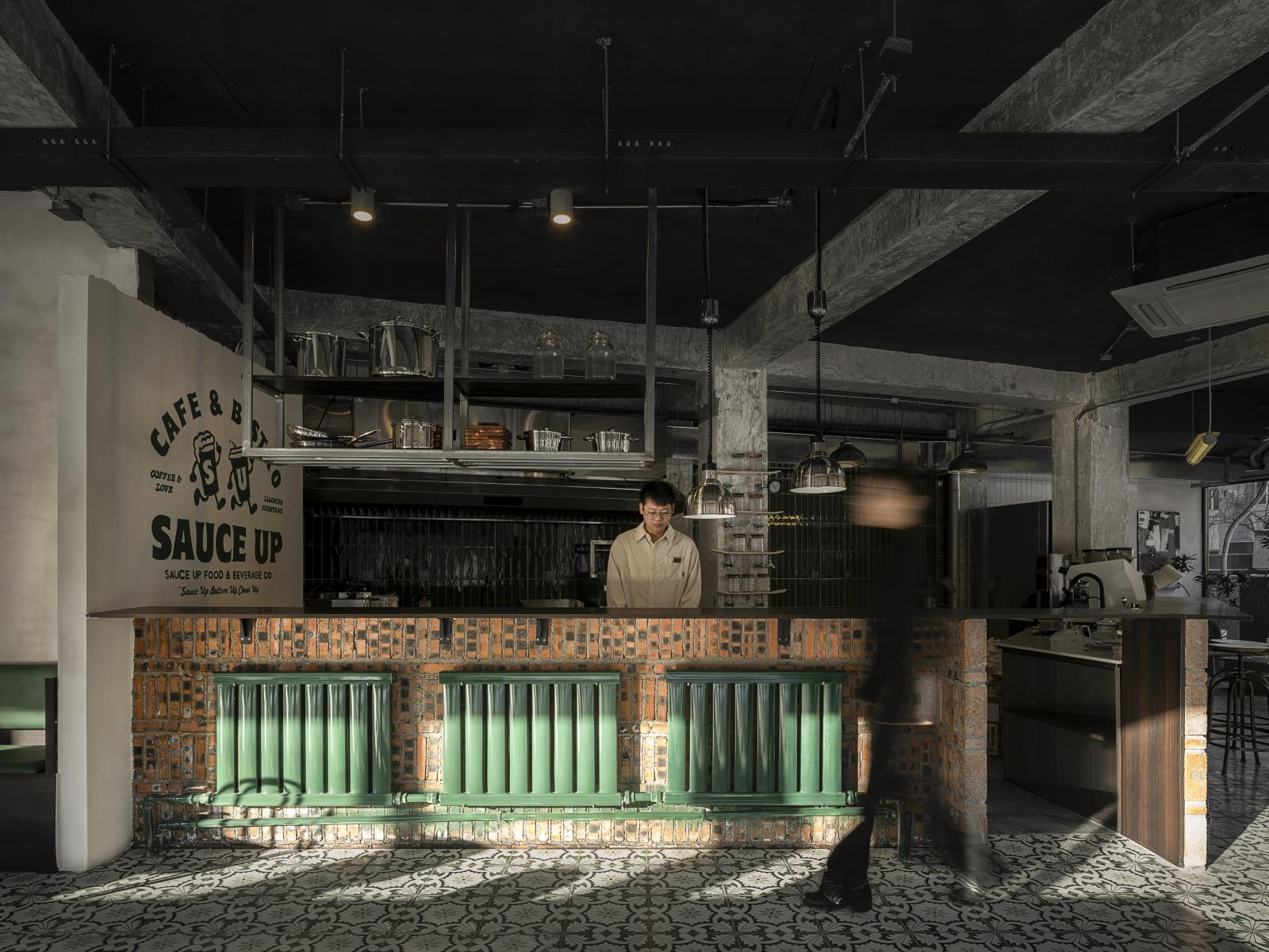
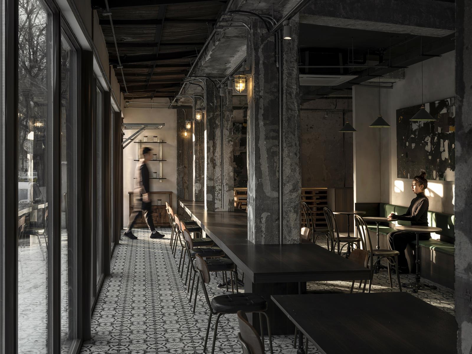
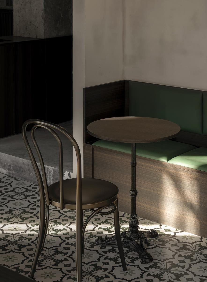
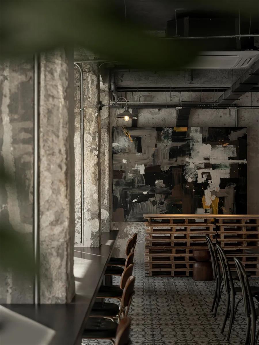
The first thing one sees walking into the space is an open bar and the kitchen area. The dining area is to the left. It includes three sections: long communal tables, booths and regular tables. Customers could see through to the floricultural area at the end of the dining area. There is also a designated door for the floricultural section, allowing customers to enter and exit.
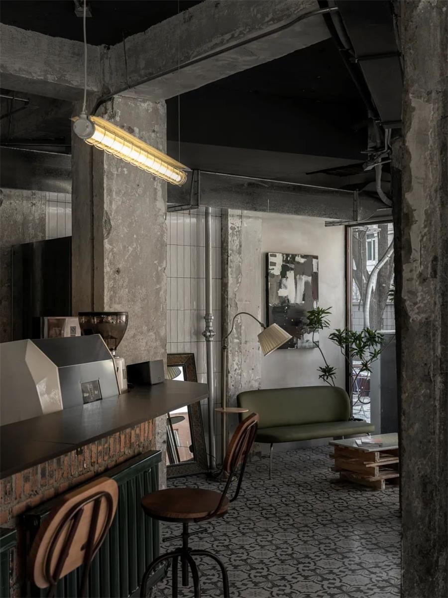
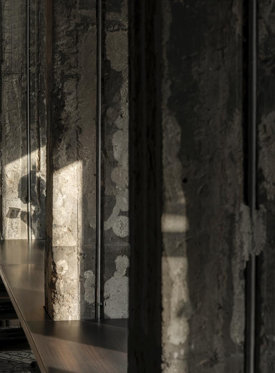
A lounge area is to the right of the entrance, providing space for people to interact. The general layout is open, self-explanatory, and allows the different functional areas to interact freely. We intentionally kept certain parts of the original structure. The original expansion of the space by the steel and wooden panels are remnants of the history here. We used metallic and wooden colors in the space to match the original color scheme. By inserting in the long tables, it not only accentuates traces of the original space, but also helps weaken the sense of separation from the pillars.
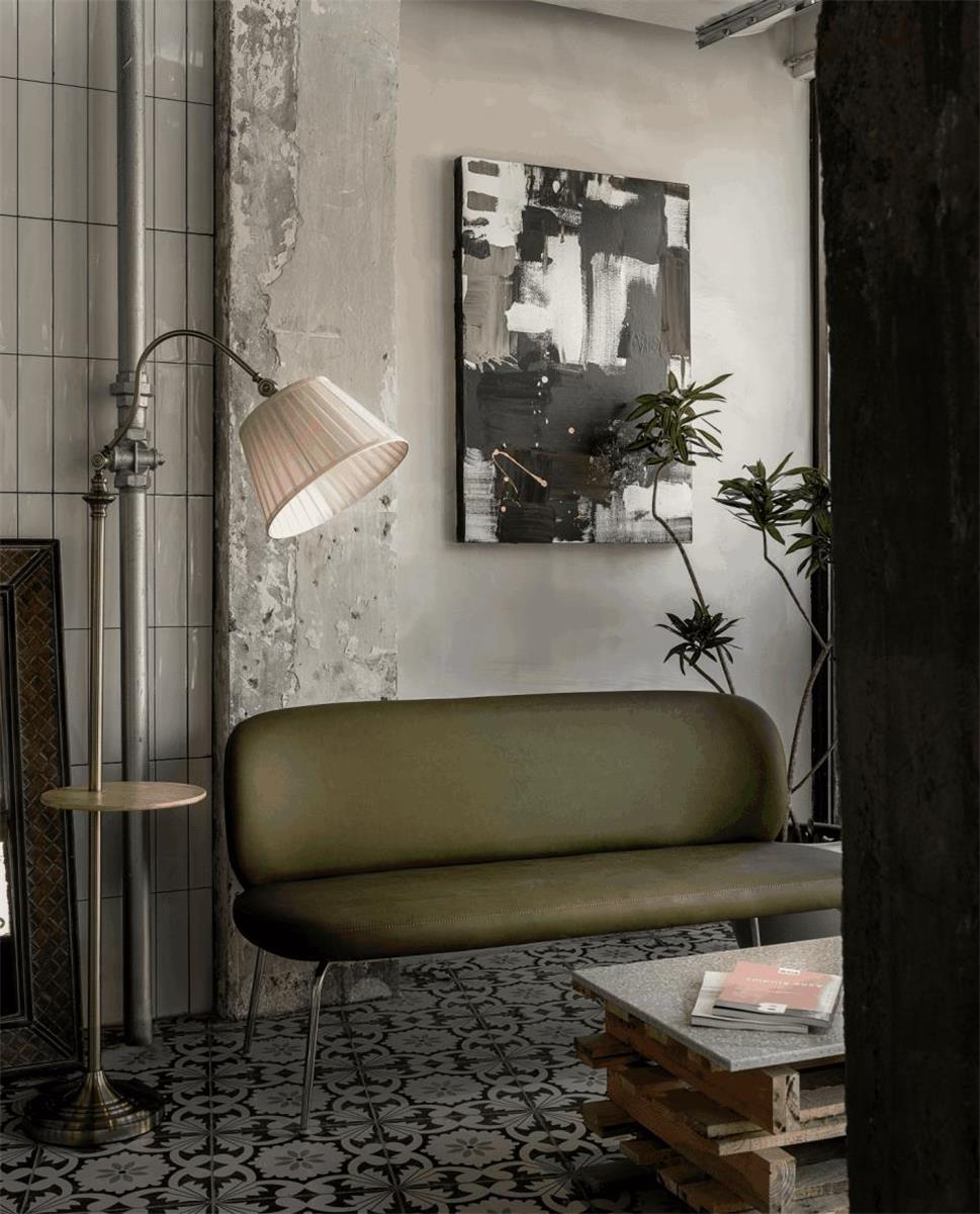
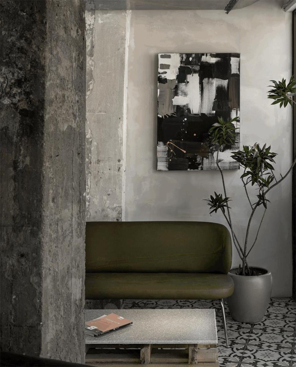
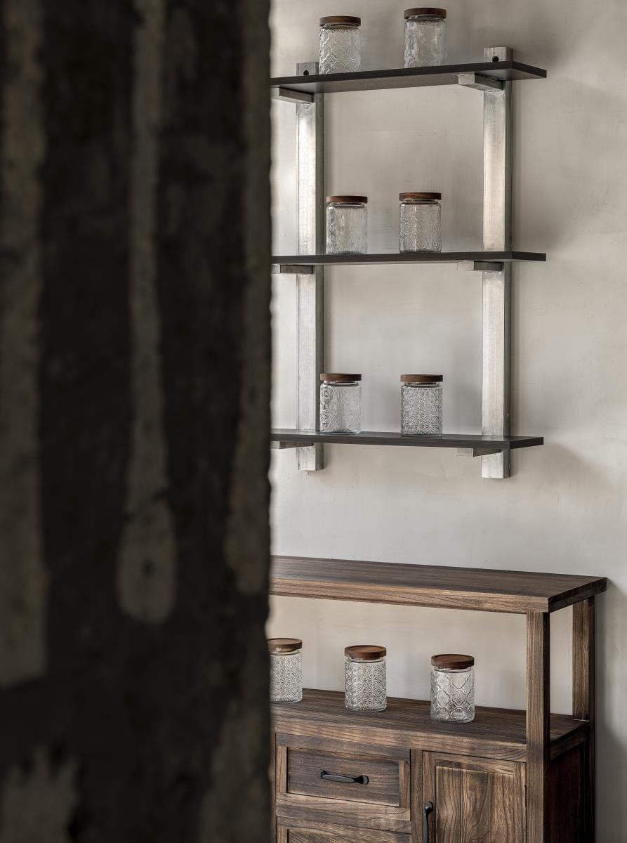
The design uses green and brown as the main visual scheme. It gives a certain American vintage style. They are also the colors of vitality and nature.The colors of the original space, the materials of the walls and the floor, the custom-made furniture, the art pieces, and the interior design all follow the main color scheme.The presentation in entirety shows a space that communicates and connects from within.Because of this visual framework, the power of the colors expands and bleeds into the space.
SAUCE, communicates an openness that’s like a dynamic seasoning. BISTRO, a light relaxing vibe. We hope SAUCE UP BISTRO is a place where people and food can meet freely.We designed a space that creates relationships, fluidity and contrast, all as a part of the dynamic experience of the restaurant.


